When discussing the visual style of INVERSUS, there has always been an amusing contrast between the random YouTube comment saying that “this could run on an Atari” and the periodic questions asking how I’m actually managing to draw what is happening on screen. We’re going to take a detailed walk through how INVERSUS Deluxe composes a frame, but for fun let’s start off by looking at an actual demake of INVERSUS for Atari that Ed Fries was toying around with (believe it or not, just finding a way to render the obstructions on the map was non-trivial).
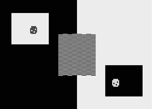
Can you spot the difference?
The Constraints
Before we deep dive into the breakdown of a frame, let’s get some context for the problems that need solving.
Seamless wrapped worlds that unfold onto the screen multiple times.

Dynamic color palettes that support invertable effects.

Alias free rendering with a panning camera.
Render at a smooth 60fps on Nintendo Switch™.

Screen Wrapped Maps
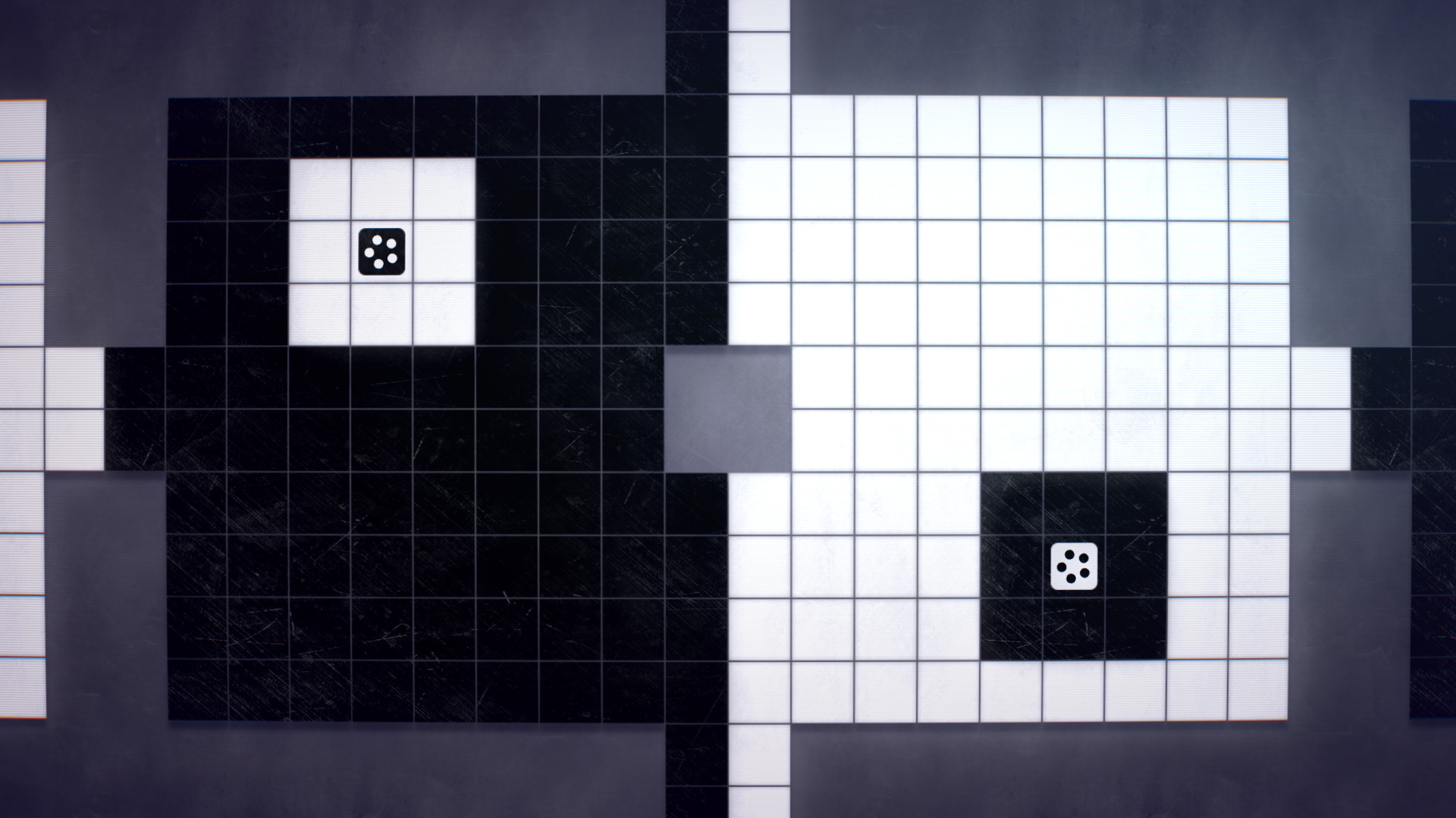
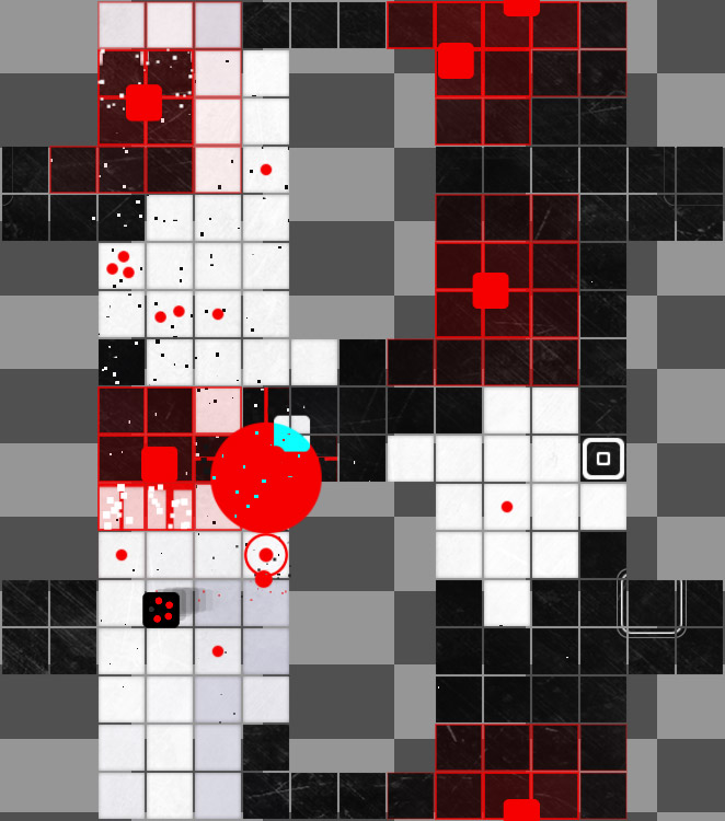
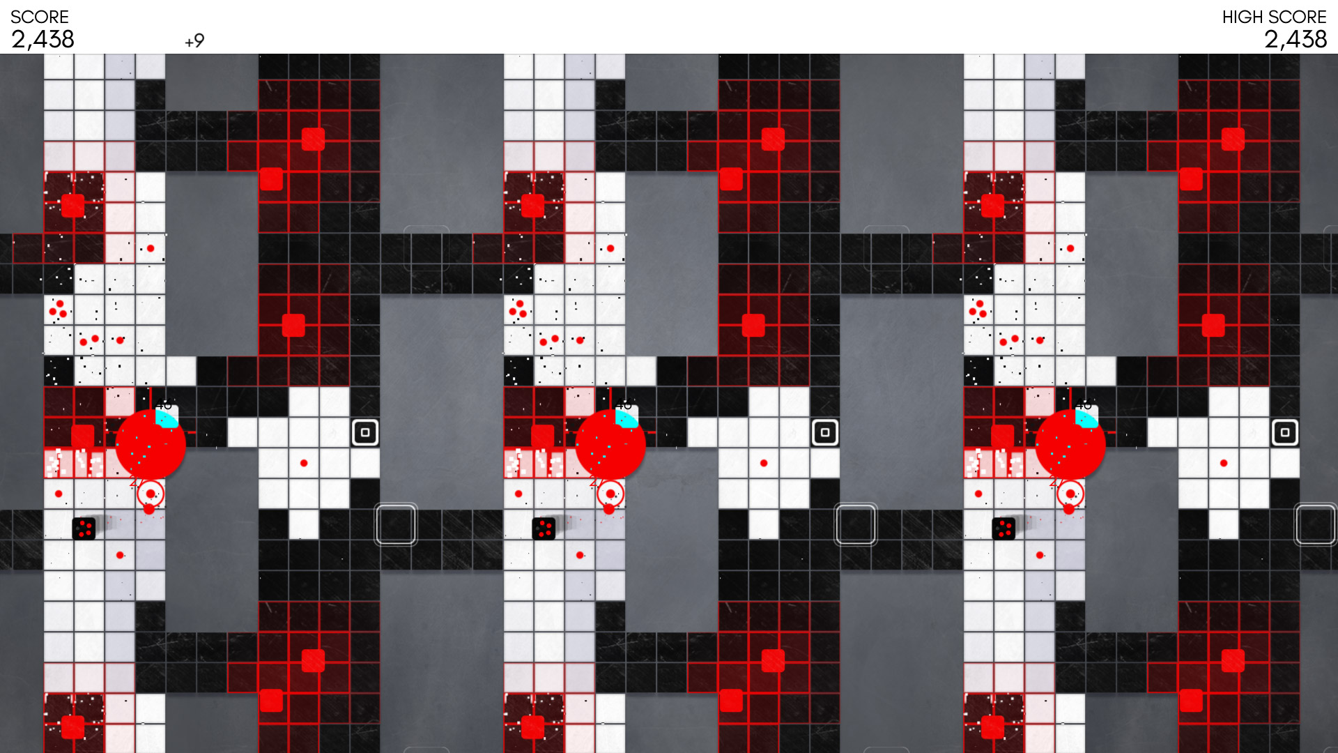
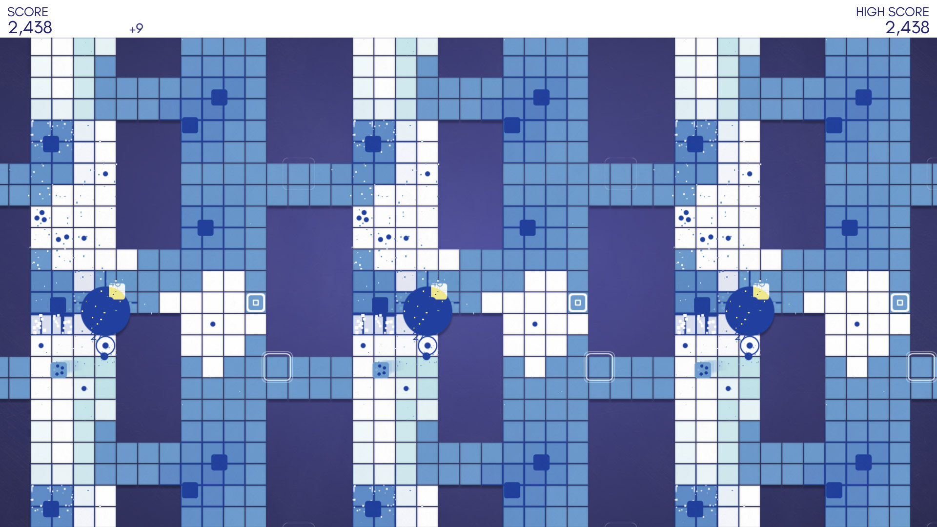
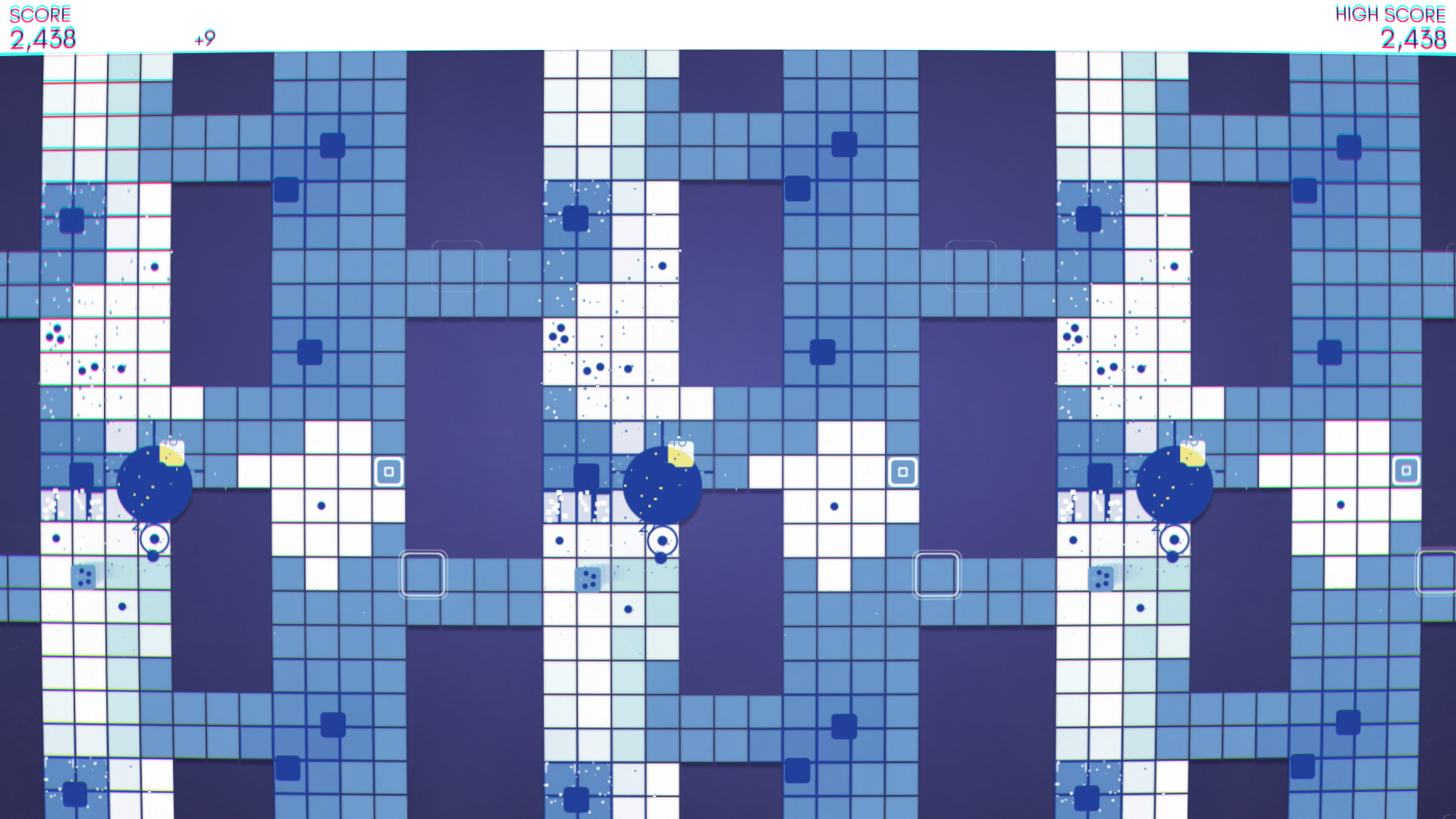
This is the frame we are going to break down. It was captured in the middle of an Arcade Mode game as the screen was starting to shake and distort due to that big red explosion in the center. What I really want to call your attention to, however, is how the level wraps around the edges. You can actually see the toroidal space unfolded creating multiple instances of the player!

So how does INVERSUS render its wrap-around maps? The basic idea is to render the unique portion once to an off-screen texture and then render that multiple times in whatever pattern is necessary. For this to work, anything that renders to the off-screen texture needs to be able to render multiple times (up to 4) to support cases where objects overlap an edge or corner. The actual off-screen texture is sized to match the display resolution because that is guaranteed to be supported on all relevant hardware and is guaranteed to be large enough to render a level. The render process, however, sets the viewport to only draw a game sized region in the upper left corner of the full texture.
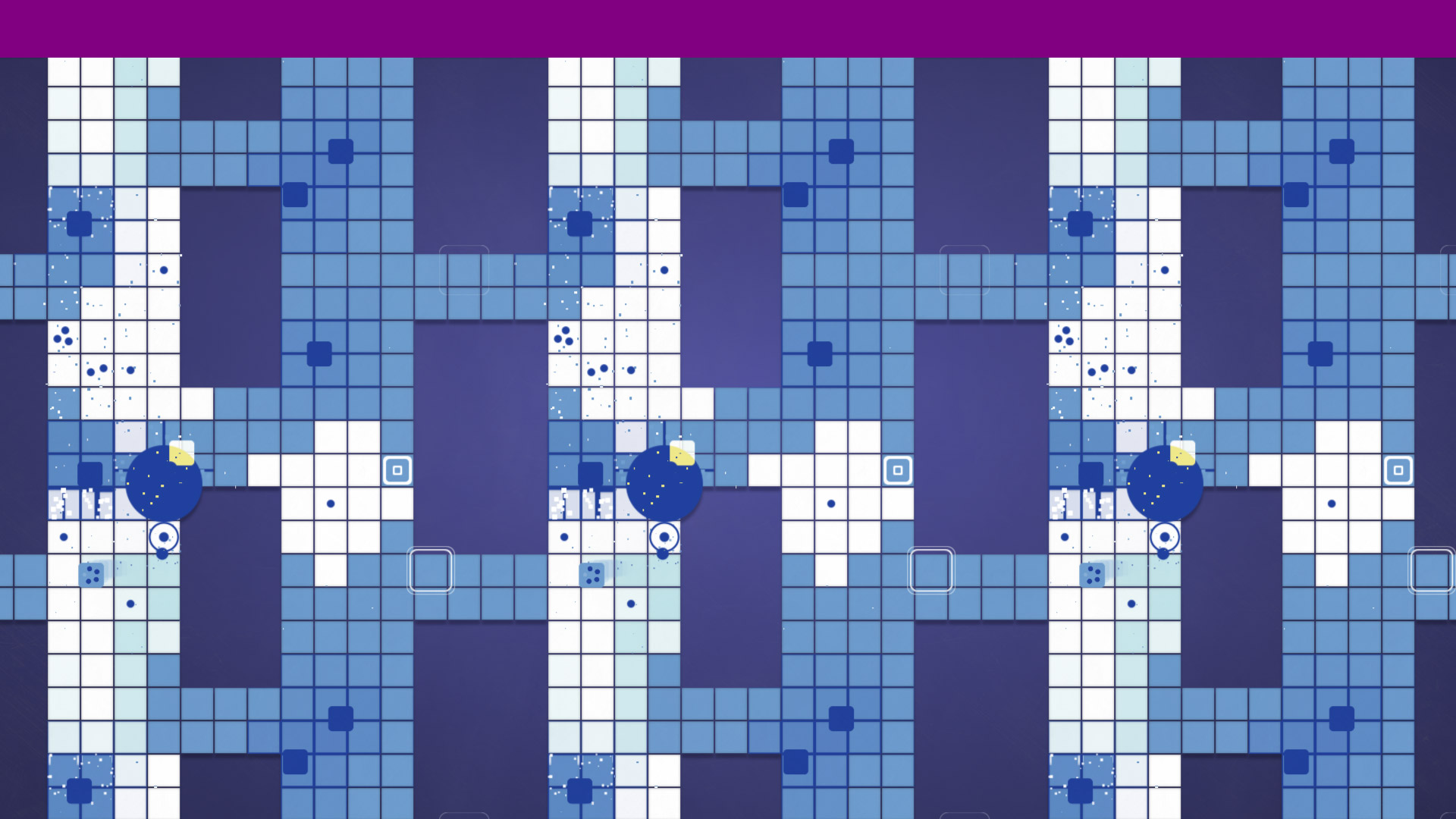
Let’s look at a few examples of wrapping in practice. The quads rendered from the off-screen texture are outlined in yellow.
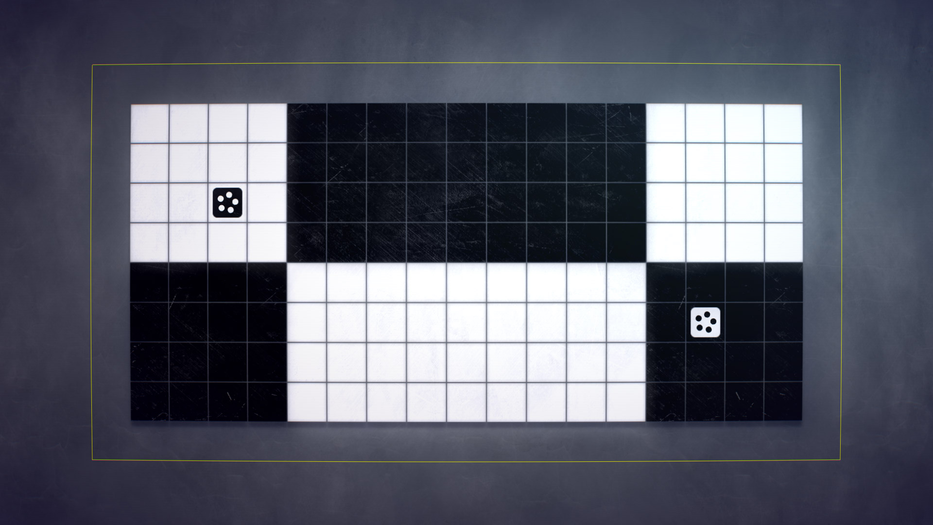
Simple map with no wrapping.
Standard wrapping where top connects to bottom and left connects to right.
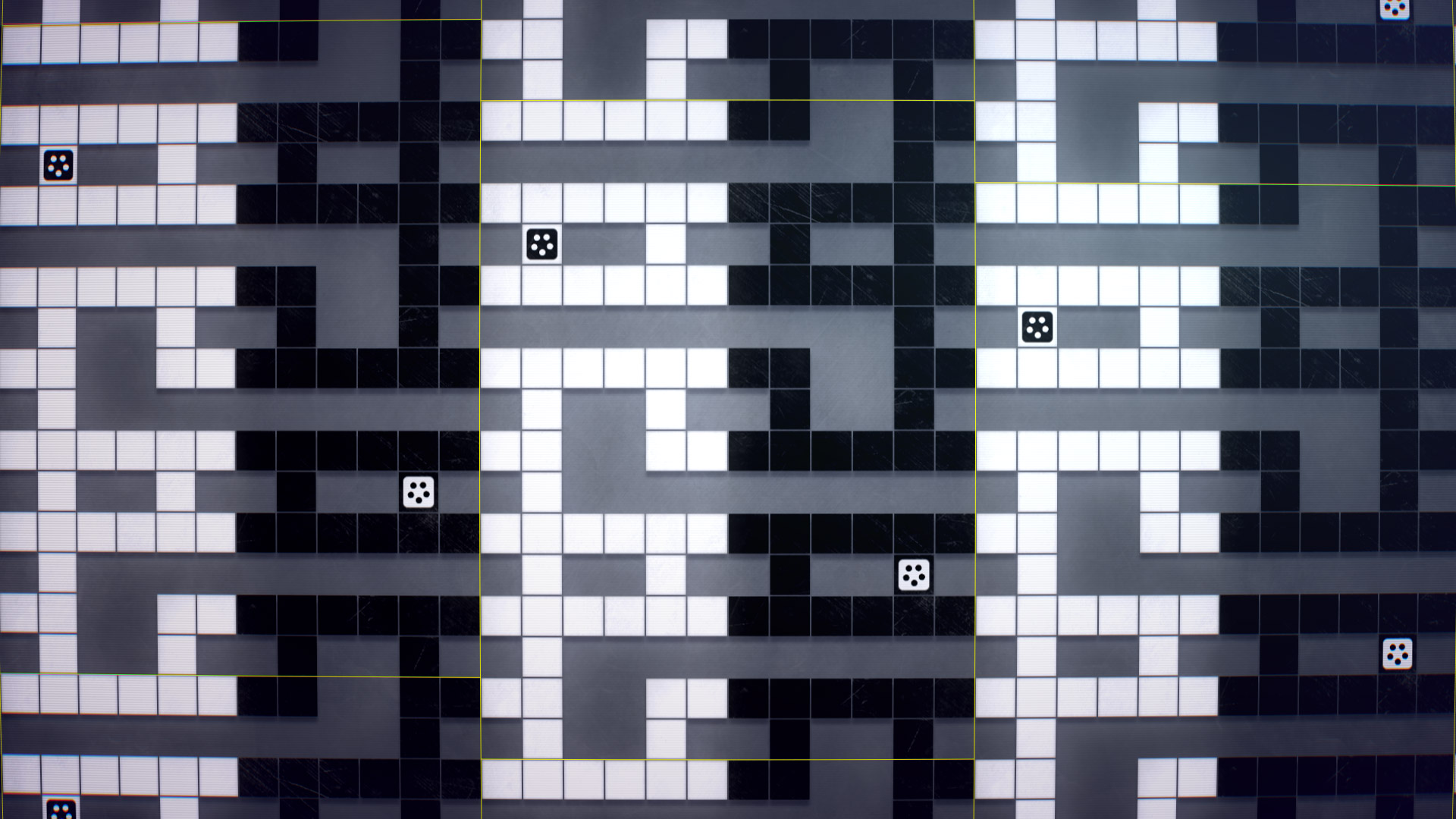
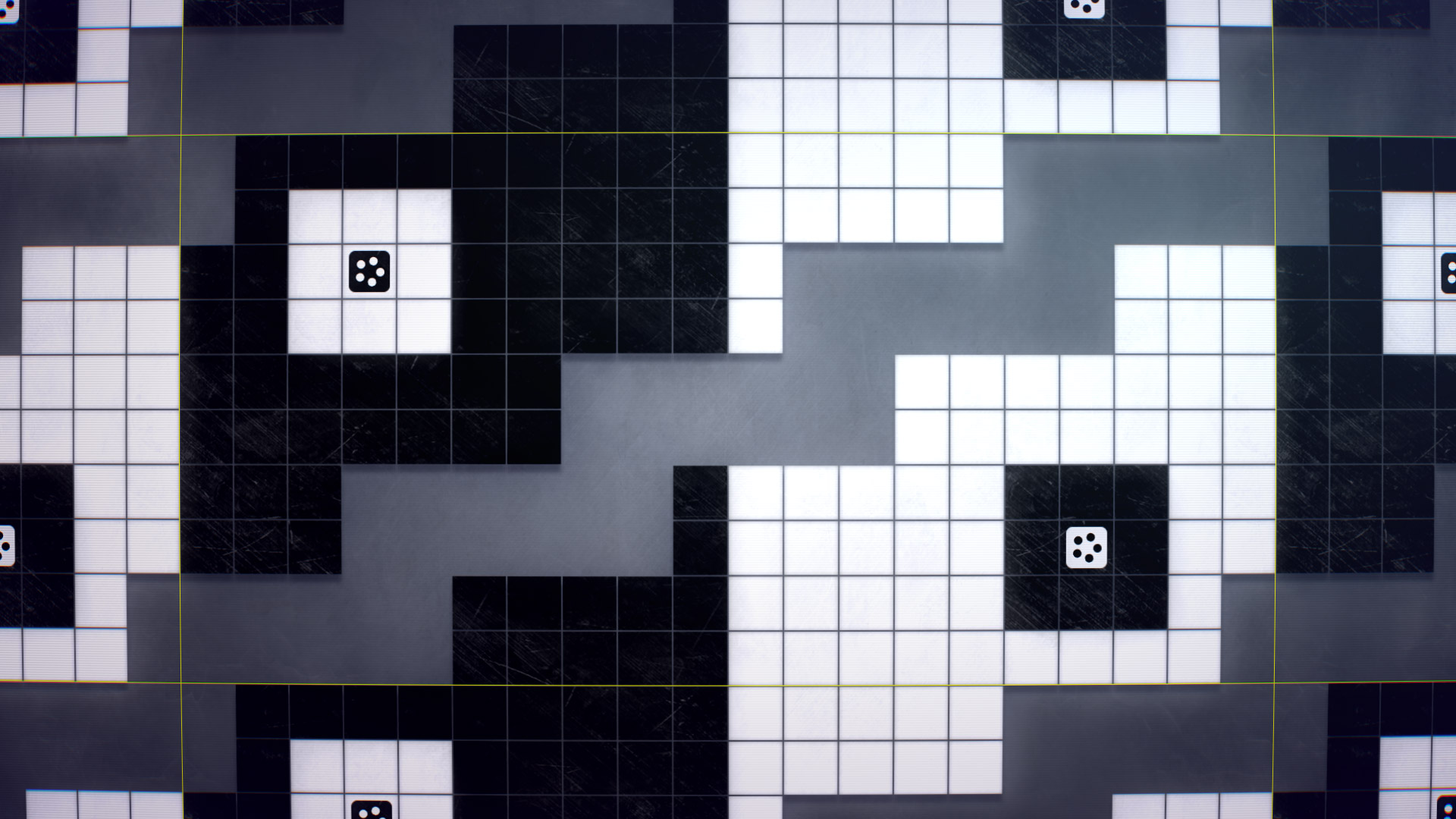
Offset wrapping where the map shifts with each iteration. This can hurt the brain.
Given a stationary view of the map, things would be simple, but INVERSUS supports a panning view for scrolling levels and for screen shake. Without extra care, this creates sub-pixel inaccuracies at the wrap boundaries. As the camera pans, the rasterized pixel coverage of each quad will snap from pixel to pixel even if the underlying floating point values are moving smoothly! This causes the edge texels to flicker because the displayed UVs stretch and compress past the edge as the rasterization pops from one pixel to the next.

When rendering the game texture, an additional pixel is rendered on each side (increasing the viewport size by 2 pixels in width and height). Assuming we handle elements rendered off the edge of the view correctly, these edge pixels will duplicate what is on the opposite side of the texture. ![]()
When rendering a quad that uses this texture, we just need to inset the UVs past the border texels. The result creates a smooth seam between quads because as the rasterized vertices pop from pixel to pixel, the texture sampler will correctly pull from the border pixels using standard bilinear sampling.
INVERSUS uses a similar approach for sub-pixel accurate rendering of sprites (e.g. ships, tiles, etc). By ensuring a transparent border of one pixel exists at the edge of the sprite, we can guarantee perfectly smooth motion without a heavy weight anti aliasing process.
Rendering the Frame
INVERSUS is primarily a seven color game: game background, team A, team B, power, inverted power, menu background, menu text. In practice there is more nuance including parameters shadow color, rare animated colors and more, but let’s keep things simple for discussion purposes.
I’m going to show how the frame is composed with examples from two different color palettes in each step. The important parts of each palette are as follows:
| Palette A | Palette B | |
| Game Background | ||
| Team A | ||
| Team B | ||
| Power Normal | ||
| Power Inverted | ||
| Menu Background | ||
| Menu Foreground |
Due to it’s limited color set, INVERSUS uses shape for most communication. Colors are then selected to “invert” back and forth as graphical elements are layered on top of one another. I put “inverted” in quotes because the inverted colors aren’t always complementary (i.e. mathematically inverted) but are more toggling back and forth between the two team colors. For example, when rendering the ships and ammo we might render the board blue and the ship white and then the ammo blue.
Problems arise when we start talking about graphical elements that can overlay both sides of the board such as spawn effects, bullet clash effects, and explosion debris. These elements need to choose the “inverted” color at per-pixel accuracy. This requires rendering said effects into an inversion buffer that masks out what parts of the screen get per pixel “inversion”.
Just like when we render the game instance, this has a one pixel wide border.
The next step is rendering color to the off screen game buffer. Each rendered element (tiles, ships, pickups, etc.) is supplied with a normal color and an inverted color. The inversion buffer is sampled to blend between the two.
As a quick aside, I should mention an interesting problem with the game texture that has been glossed over thus far. The viewport needs to be sized such that the narrow lines between tiles align with the pixel grid. This keeps each line equally crisp rather than the lines oscillating between pixel alignment and misalignment. To make this work for any resolution, we can’t just linearly scale up the game texture size but instead need to snap it to legal intervals based on the desired screen area and the number of tiles on the grid.
 |
 |
Note how the inverted cube in the center changes to different colors when over the tiles compared to when over the explosion.
With the desired color in place, we can add some texture. This technically happens within the same render pass as the prior step, but has been separated here for clarity. Each color channel independently blends between four monochromatic pattern maps according to it’s value.
I considered allowing different patterns assigned per color palette, but it was cut for time. The only pattern map used in INVERSUS Deluxe looks like this:
The four pattern maps are actually stored in a single RGBA texture with one map per channel.
When sampling the pattern texture, UVs are computed such that the size of a texel on the pattern texture matches the size of a pixel on the screen. This creates maximal fidelity at any screen resolution. The UVs for the map tiles are chosen such that the pattern continues from one tile to the next. This creates a satisfying “lock into place” as they animate in at the start of a map. The ships, however, are assigned an arbitrary offset in the map to separate them from the rest of the board. All of these UVs are also shifted by a random value at the start of each match creating variety and the appearance of new tiles being pulled in from the ether.
Given the input color from the previous step and a sample from the pattern texture, the pattern mapped result is computed as follows.
// Get pattern texture channel weights for each input color channel.
// The first pattern map channel represents black and final represents white.
// Weights cross fade between channels according to input brightness.
inputColor *= 3.0;
half4 weightX = (half4)saturate(1.0 - abs(inputColor - 0.0));
half4 weightY = (half4)saturate(1.0 - abs(inputColor - 1.0));
half4 weightZ = (half4)saturate(1.0 - abs(inputColor - 2.0));
half4 weightW = (half4)saturate(1.0 - abs(inputColor - 3.0));

half4 mappedColor = patternColor.x*weightX +
                    patternColor.y*weightY +
                    patternColor.z*weightZ +
                    patternColor.w*weightW;
By blending from input color to the pattern mapped color, we get the final game texture! This method of texture application creates a more natural feel as the individual pattern maps blend into one another. This also hides the fact that they are wrapping multiple times on screen.
 |
 |
The left palette blends at 80% and the right palette blends at 20%.
When we finally render the game texture onto the screen, it needs to cast a soft shadow on the background. Being the only shadow caster in the scene, we can take a shortcut by casting the shadow similar to how it is done in Photoshop. We will blur the game texture, and render it with a solid color at a lower offset on screen. While the result is often the same from frame to frame (the map is stationary), it is still recomputed each frame to support the animated map introduction and to support casting shadows from explosions that overhang the map edge.
In contrast to the shadow method used in gameplay, the title menu actually has numerous shadow casting blocks scrolling by and needs a more expensive separate shadow implementation. It uses a fairly standard depth buffer approach and does some rudimentary percentage-closer filtering of the results.

On the title screen, depth based calculations are required such that shadows from foreground tiles appear correct when cast onto other tiles compared to the background.
Getting back to the in-game shadows of our frame, we render a horizontal Gaussian blur to a new buffer. Note that we need to correctly wrap the blur samples at the edges of the buffer and take our special border into account when computing the UVs. The blurred result needs to wrap seamlessly.
 |
 |
The vertical blur pass will be performed when we actually render the shadow on screen. In the case of a map that wraps multiple times, some processing could be saved by blurring to a separate texture and then reusing the result, but that is more costly for a map that is not wrapped. Thus, I only optimized for the worst case scenario.
With our game texture and blur texture in hand, we can start rendering to the screen buffer. Normally this just renders over whatever data remained from a prior frame, but for clarity purposes I’m going to start with a solid color.

The background is a procedurally generated gradient between two colors. Do you see the empty strip at the top of the screen? That is an optimization for fill rate because we know that in arcade mode, an opaque score bar will be rendered there. I should also point out that there is room for more optimization here if we stenciled out areas in which the game board is known to be opaque.
 |
 |
The background runs the same pattern mapping logic that was discussed for the game buffer.
 |
 |
When rendering the the game screens on top, we make sure to compute UVs that inset within the extra border pixels of the game texture.
 |
 |
You might notice that the enemy spawning effects which were purely driven by the inversion buffer are now clipped to the edge of the map. To correct for this we actually sample the inversion buffer in addition to the game buffer. The inversion buffer is rendered in the color of Team A and the game buffer color is blended on top.
 |
 |
As part of rendering the game texture quads, we also compute a vertical blur (accurately wrapped) of our horizontally blurred texture. By computing the vertical blur at a vertical UV offset, we can slide it downwards on screen and use the resulting opacity to render an offset drop shadow.
 |
 |
The only UI elements on screen are the score bar and a couple pop-up point values near the explosions. However, this pass is also where pauses menus would be rendered. The aforementioned pop-up score values are a bit hard to see because they are overlapping similarly colored game elements. In motion, they actually flash between two colors to alleviate this issue. You can see the edge of one poking out over the inverted square next to the explosion and you’ll also notice that the game has correctly duplicated the UI element for each game instance that was rendered. While these could have been rendered within the actual game buffer to get screen wrapping support, managing them separately ended up being easier due to specifics of my UI rendering architecture.
 |
 |
The UI gets the same pattern mapping process applied, albiet with a different tuned blend percentage. Unfortunately, the only notable UI in the screenshot is the score bar at the top of the screen and the score bar happens to be an exception to the rule. I think I kept the pattern off of the score bar to help it “pop” but my memory is a bit fuzzy and it was possibly just an oversight or last minute fill rate optimization. For demonstration purposes, you can see the pattern applied to a pause menu here:
 |
 |
To prepare for the post process phase, we need an extremely blurred version of the screen. We start by downsampling 4 times.
 |
 |
Applying a horizontal blur followed by a vertical blur to the final downsample gets us what we need.
 |
 |
 |
|
To start, we apply a barrel distortion to the screen by distorting the UVs. This stretches and blurs the center of the screen so it is very important that we’ve made everything as crisp as possible up until this point. At the same time we slightly separate the UVs per color channel near the left and right screen edges to add some cheap chromatic aberration.
 |
 |
During this specific moment, the game is processing an explosion that shakes the screen and amplifies the chromatic aberration from its normal setting. This all happens in the periphery and very fast, but it helps sell the feeling of your monitor being kicked. This is just one small part of the sauce that makes people constantly say INVERSUS “feels good” without being able to articulate exactly why.
 |
 |
The blurred screen buffer is sampled to apply an “invertable glow” that silvers the image. We use a desaturated sample from the blur buffer to decide if we should glow light (add blue) or glow dark (subtract yellow). When applying the glow, light and dark areas are masked out from the respective light and dark glow operations to prevent colors from getting blown out.
half3 glowClrDark  = half3(-1.0,-1.0,-0.5);
half3 glowClrLight = half3(0.5,0.5,1.0);

// sample a desaturated value from the blur texture (desaturation would optimally be precomputed during the blur pass)
half sampleVal    = dot(blurSample.rgb, half3(0.3, 0.59, 0.11));
half invSampleVal = 1.0 - sampleVal;

half sampleVal2    = sampleVal*sampleVal;
half invSampleVal2 = invSampleVal*invSampleVal;

// choose where to glow
half darkWeight  = invSampleVal2*invSampleVal2;
half lightWeight = sampleVal2*sampleVal2;

// don't darken dark areas and don't lighten light areas
half doubleSampleVal = sampleVal*2.0;
darkWeight  *= (half)saturate(doubleSampleVal);
lightWeight *= 1.0 - (half)saturate(doubleSampleVal - 1.0);

// apply glow
color.rgb += glowAmount * (darkWeight*glowClrDark + lightWeight*glowClrLight);

// saturate after glow because the negative dark glow can cause issues when below zero
color.rgb = saturate(color.rgb);
 |
 |
Add some scan lines that curve with the barrel distortion and fade out towards the screen center. This adds flavor but retains clarity.
 |
 |
Multiply on a tinted vignette.
 |
 |
Add a little bit of blue light to the edges to get a hint of color and more glassy feel.
 |
 |
Finally, add some specular glare from the upper right.
 |
 |
This article has been more about process than artistic vision, but my goal was to deliver a retro arcade game projected into an alternate high definition future. Along with the continuously wrapped worlds and invertable effects, INVERSUS creates a unique visual experience to accompany and enhance the novel combat puzzle that it presents the player.
No Comments
You can leave the first : )